Tools: Adobe XD, Photoshop & Illustrator
Company: fieldmargin | 2019-2023
Brief: Build different functionality, followed by the users' feedback and ideas, create new features, and improve existing ones, helping farmers to have an app and a web app adapted to their needs.
Challenge: From the many features, adding livestock was one of the features that took longer and required a lot of teamwork. Being a new feature with new functionalities, it needed to be created and adapted to the existing flow of the app and web app.
Create Livestock
This project involved extensive research, including a thorough competitor analysis and user research based on feedback. One of the primary challenges was to create a new feature that integrated seamlessly with existing brand guidelines while adding significant value to both the app and web app.
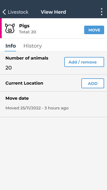
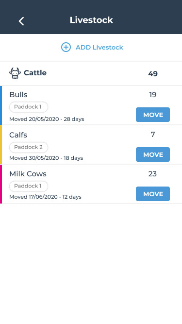
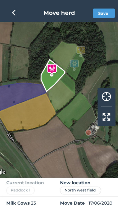
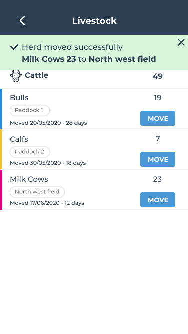
The usability focus was on devising a streamlined, intuitive process for managing livestock. I redesigned the flow so users could easily select a livestock type, which would automatically populate the Herd list with a default name. From there, users could customize the name, input the number of animals, select a color, and save their choices. After saving, they were prompted to the “View Herd” page, which displayed all their entries and allowed them to assign a location to each herd.
By formalising this process and centralising all essential actions, we refined and strengthened the overall usability. This upgrade transformed the livestock management feature into a more efficient and user-friendly experience that aligned with our brand standards and user needs.

Create Livestock wireframes

View Herd wireframes


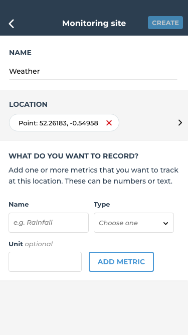
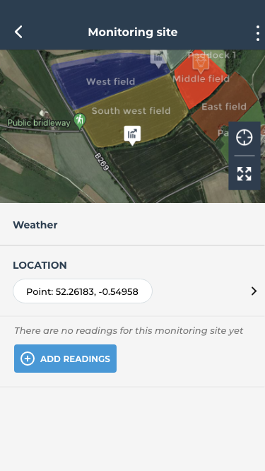
Data Monitoring
This feature already existed, but it needed to be overhauled and streamlined to simplify how information was added. One of the biggest challenges was transforming a complex data-entry process into an intuitive experience that users could navigate easily, without additional training or guidance.
After analyzing the user journey and reviewing multiple user accounts, we found that most users didn’t fully understand how to use the monitoring site. This feature is intended to centralize data from various sources, including weather sensors, rain gauges, wind meters, and other devices users need to track. However, the interface was overwhelming for users, making it difficult for them to use the tool effectively.
To address this, we redesigned and customized the feature, incorporating clear prompts to specify the type of data users wanted to record, integrating easy location input, and enabling users to add multiple data readings seamlessly. These enhancements revitalized the feature, strengthened its usability, and ultimately created a more intuitive and engaging experience for users.

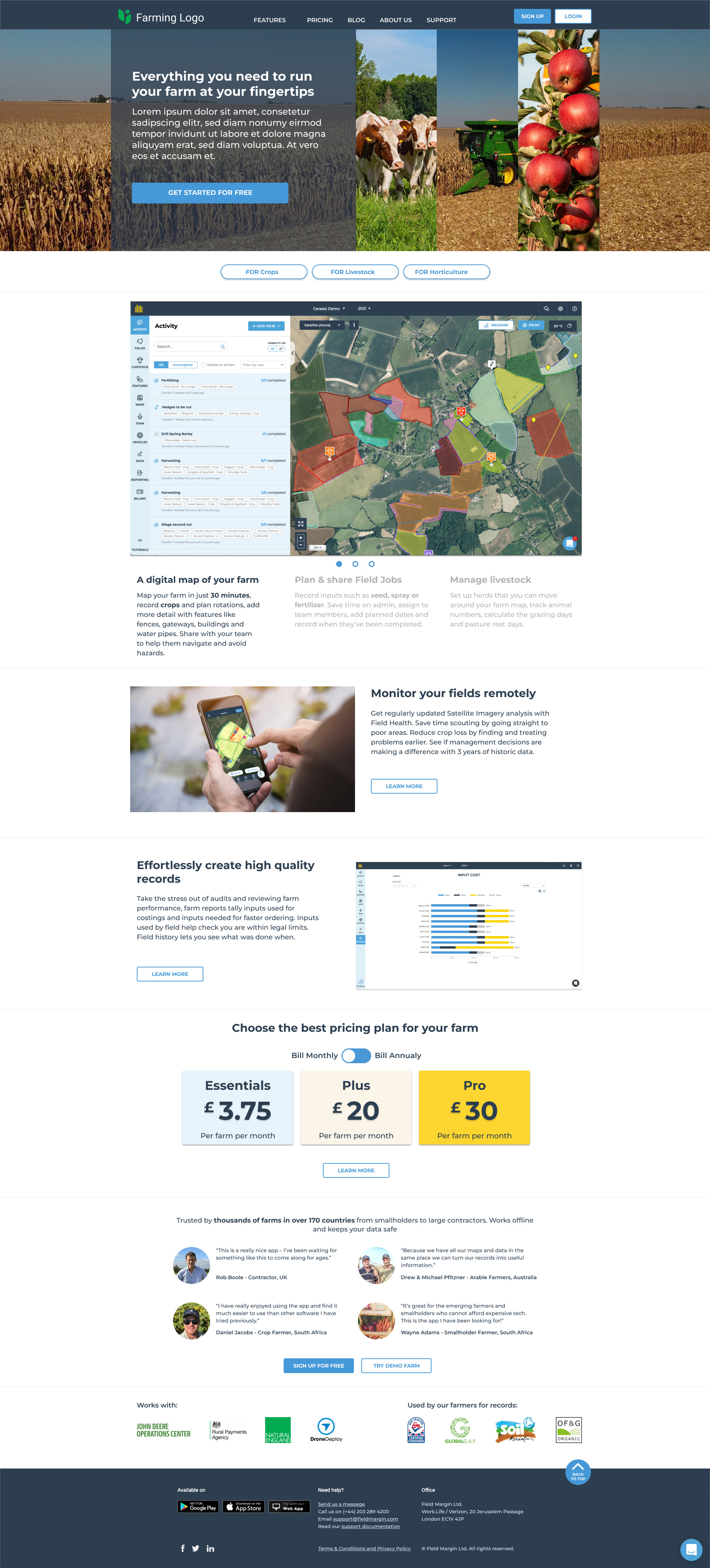
Marketing Website
The marketing website needed a full redesign to showcase new features and highlight existing functionalities that users might have overlooked. To make this clear and user-friendly, I introduced a brief introductory text, followed by industry-relevant images and screenshots of the product, web app, and mobile app.
As the primary landing page for users who haven’t yet signed up or logged into fieldmargin, the marketing site serves as the main vehicle for demonstrating the platform’s value. The challenge was that the previous site lacked clarity and didn’t present a professional look, which made it harder for users to understand fieldmargin’s features. By centralizing key information and formalizing the layout, we strengthened the site’s impact, making fieldmargin’s offerings clear and accessible to potential users.