Tools Figma & Illustrator
Company EBM Software | 2023-2024
Brief
This project involved a full redesign of an existing data analysis website, used both by clients to monitor sales performance and internally by the company.
This project involved a full redesign of an existing data analysis website, used both by clients to monitor sales performance and internally by the company.
Challenge
The redesign needed to present data clearly through charts, and support meeting scheduling, file uploads and team communication — all within a layout that stayed simple and easy to navigate.
The redesign needed to present data clearly through charts, and support meeting scheduling, file uploads and team communication — all within a layout that stayed simple and easy to navigate.
My Role
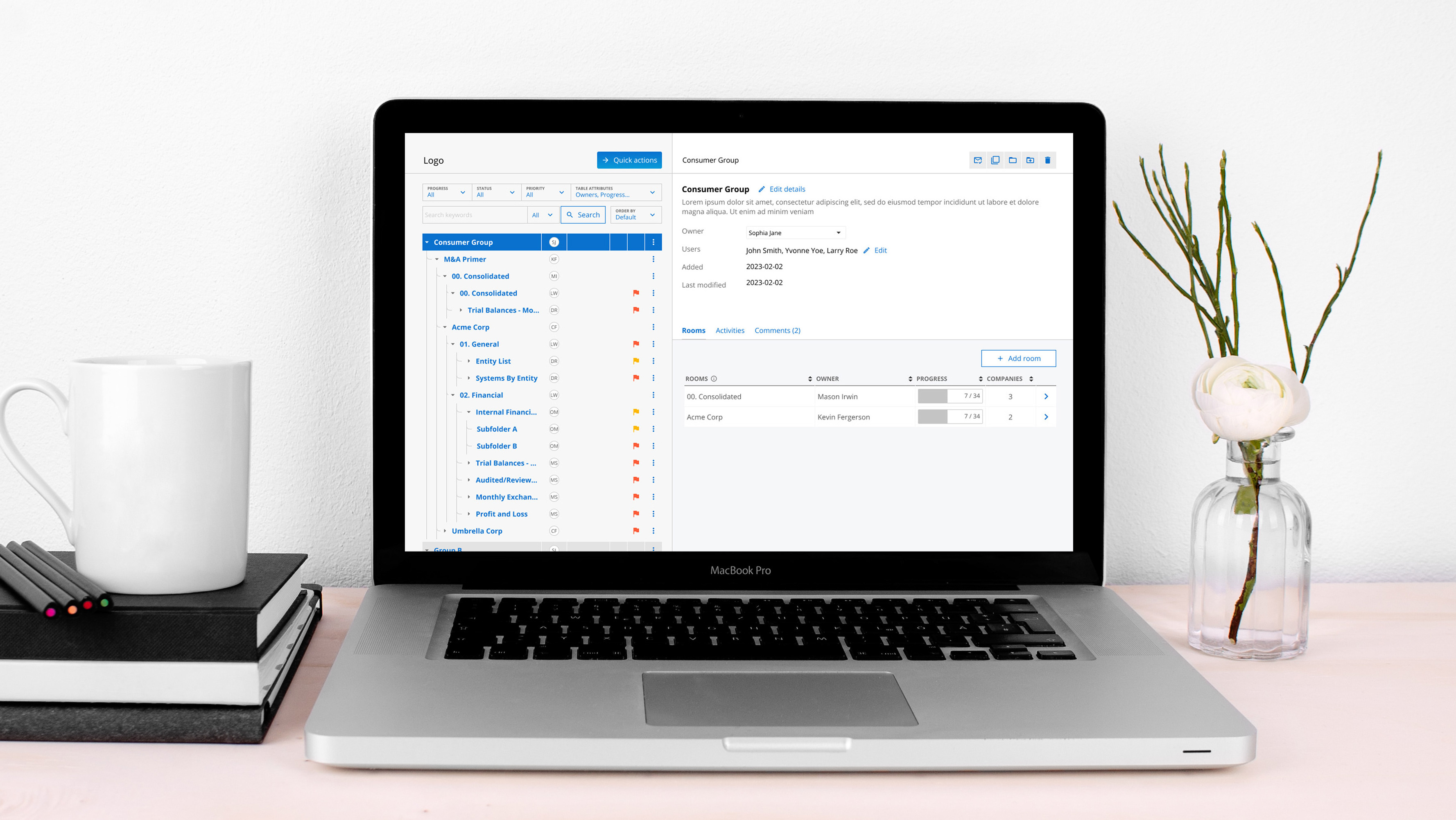
I redesigned the core UI to make the data easier to read and the experience easier to use: new charts and icons, a team hub for communication, and a documents page for uploading, organising and finding files. Throughout, the goal was a design that worked equally well for clients monitoring performance and the internal team using it day to day.
I redesigned the core UI to make the data easier to read and the experience easier to use: new charts and icons, a team hub for communication, and a documents page for uploading, organising and finding files. Throughout, the goal was a design that worked equally well for clients monitoring performance and the internal team using it day to day.
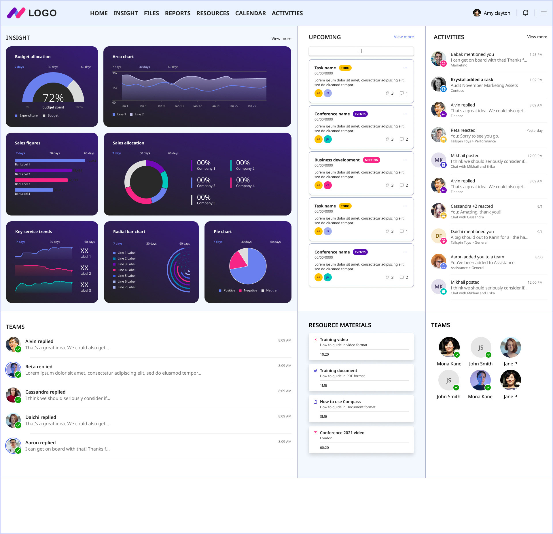
1st UI mockup

2nd UI mockup
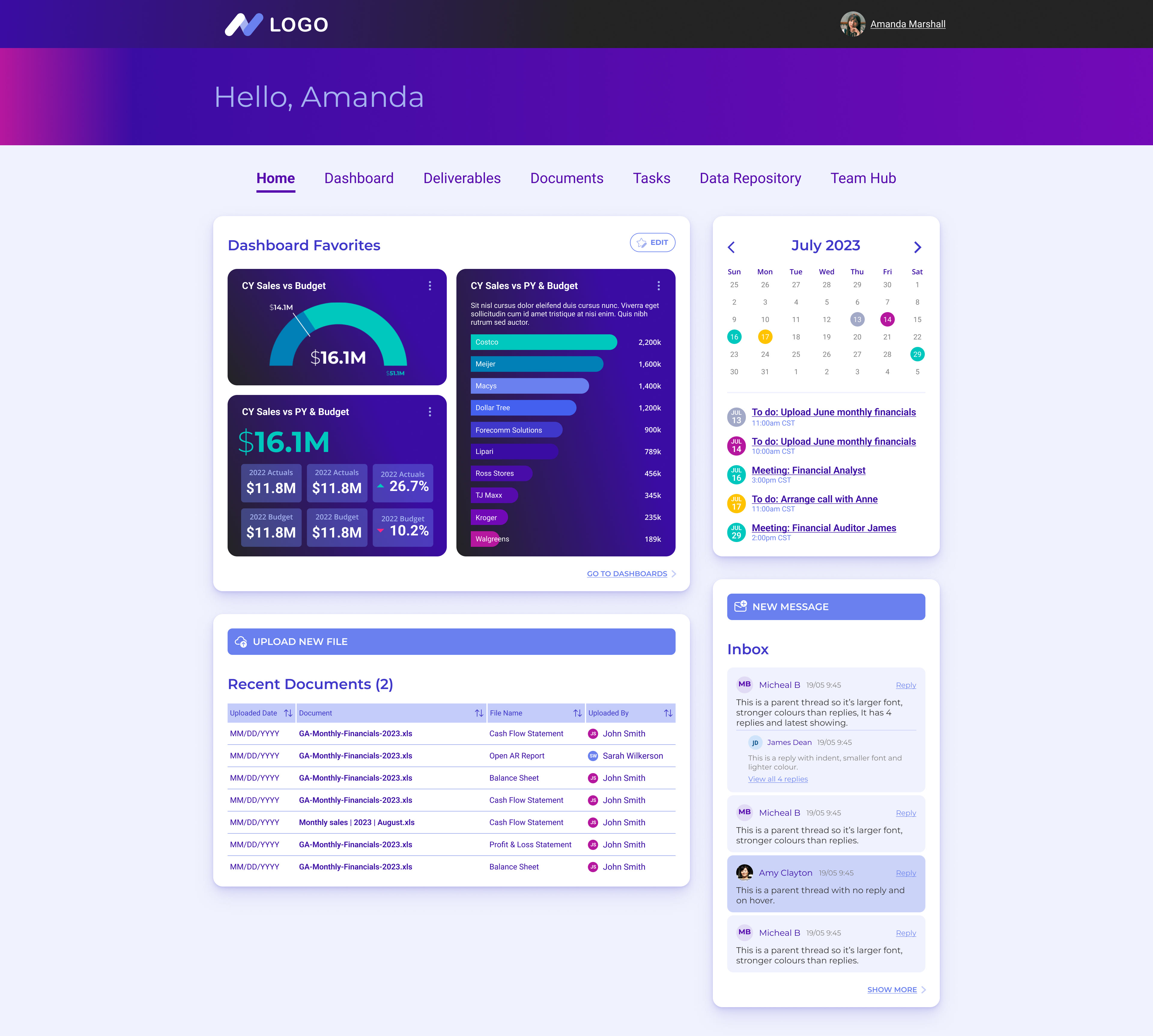
Final UI
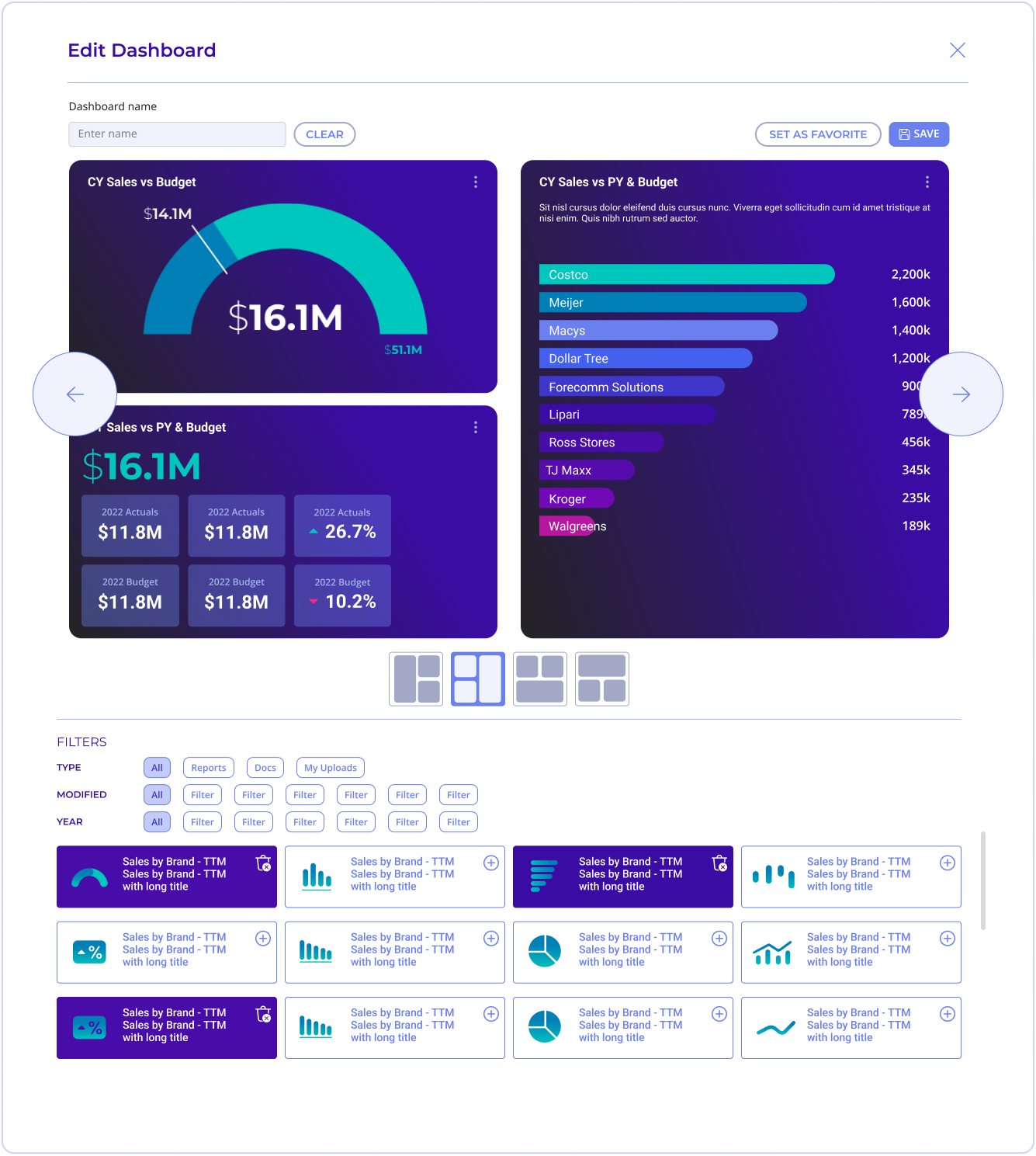
Icons & charts UI
I designed a custom icon set in Illustrator, then applied the brand colours in Figma to keep everything visually consistent. Each icon was kept simple and bold enough to stay legible on any background, so the chart types they represent are easy to identify at a glance.
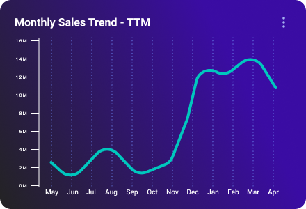
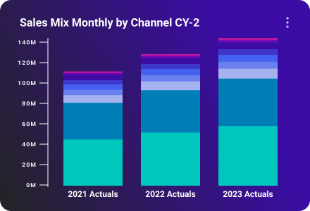
Charts were the bigger piece of this, I designed a full range, including horizontal, waterfall, line, bar, vertical combo, stacked, card display, pie and radial, each built to make the underlying data easy to read at a glance, for both clients monitoring performance and the internal team.



Content pages
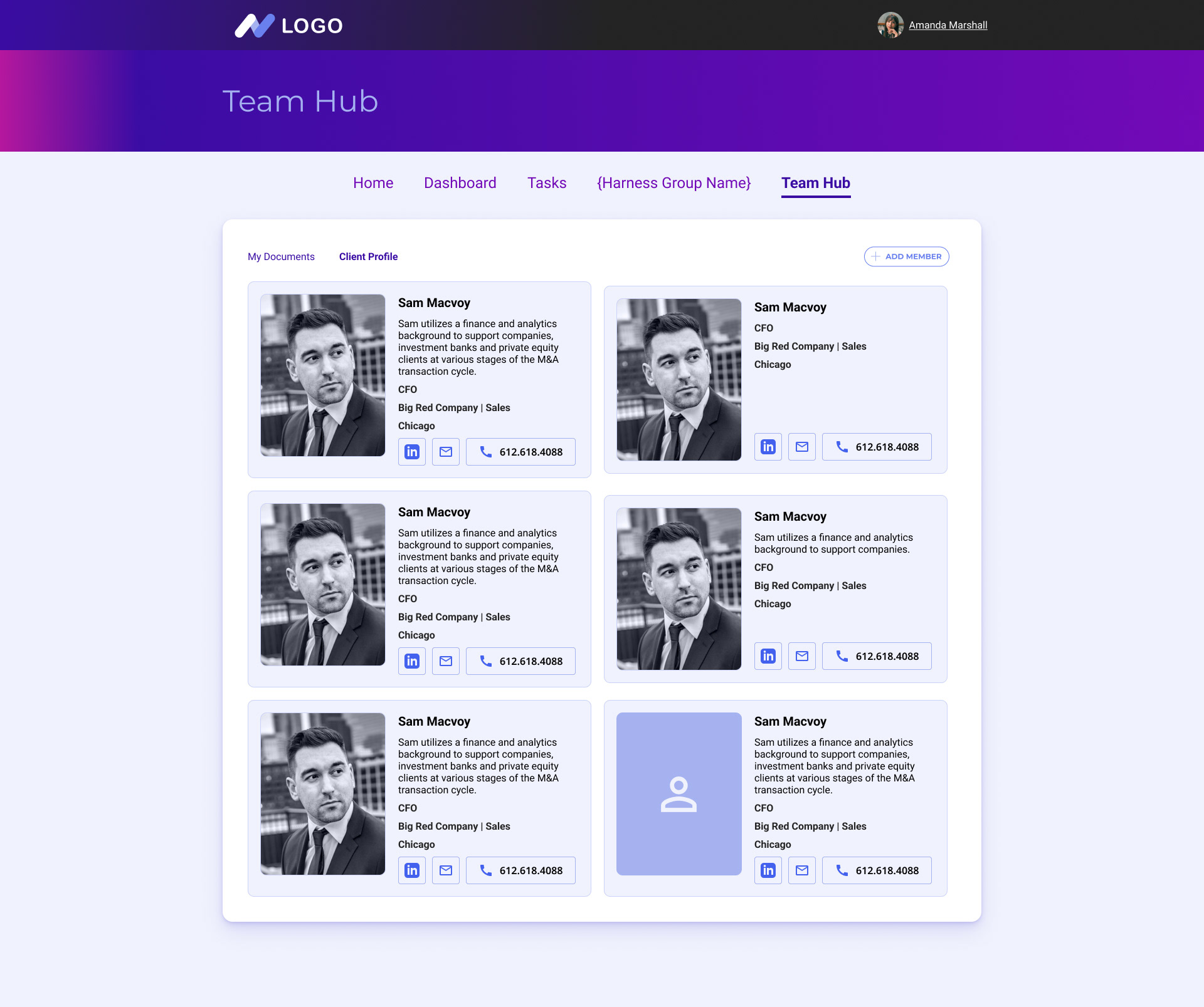
Team hub page
This page introduces the team behind the data — each member gets a digital ID card showing their contact details and role, so anyone needing to reach the right person can find them at a glance.
This page introduces the team behind the data — each member gets a digital ID card showing their contact details and role, so anyone needing to reach the right person can find them at a glance.
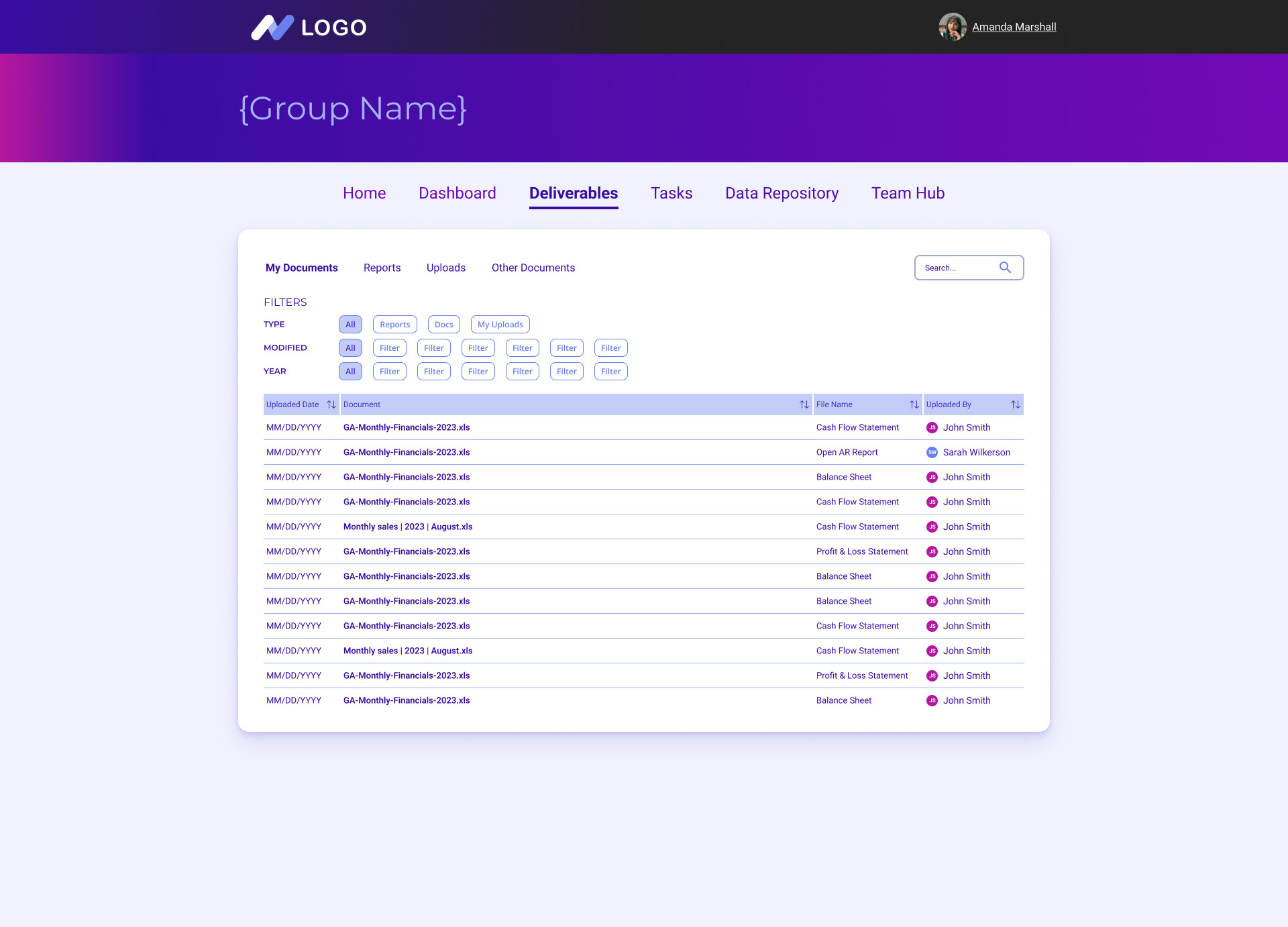
This page brings every uploaded document into one place, with clear visibility on who uploaded what and when, plus filters to narrow things down. The goal was simple: make it fast to find and manage exactly the file you need.