Tools Figma
Company Collison
Project type Case study — design challenge completed as part of a job application | 2024
Brief
The brief centred on one ambition: build the world's most valued travel ecosystem, with a customer experience that exceeds expectations at every touchpoint. I approached it from two angles. Strategically, the experience needed to support the business's wider goals, drive engagement, and work seamlessly end-to-end. Visually, it needed to reflect the brand's values, feel intuitive, and build a genuine emotional connection with users.
Challenge
The task was to design something both intuitive and functional, an experience that streamlined user interactions, supported business objectives, and stayed consistent and responsive across devices. My focus was a visual design that improved usability, supported accessibility, held true to the brand, and could scale as the product evolves.
Research and Insights
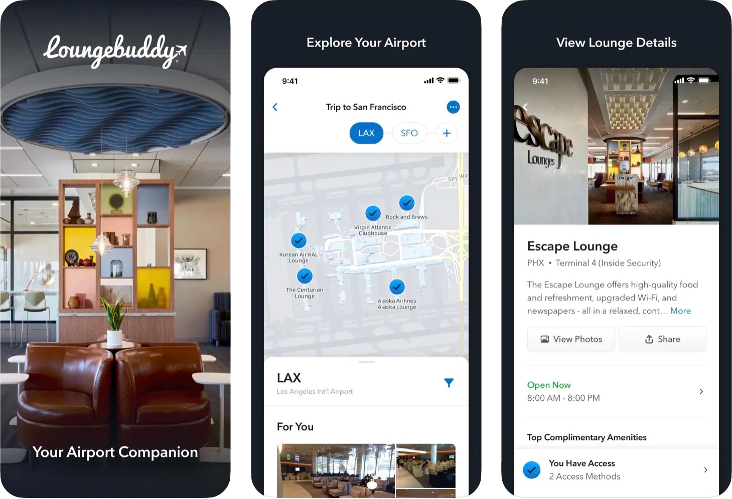
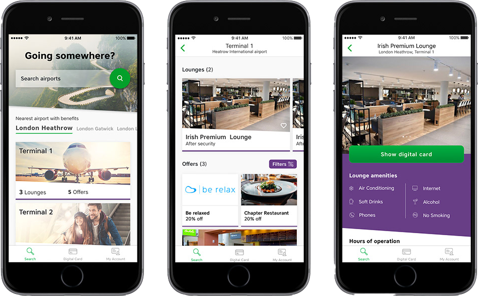
I looked at competitor lounge access apps to see what worked and what didn't, spoke to friends who use these lounges about their real experiences, and kept coming back to the questions a user would ask: what do I actually get, is it clearly explained, and who is this for?
Findings
Most competitor apps felt dated and confusing — key details like benefits, locations and booking availability were buried or unclear, and none of them felt as premium as the service itself.
Most competitor apps felt dated and confusing — key details like benefits, locations and booking availability were buried or unclear, and none of them felt as premium as the service itself.
Solution
I designed a clean, intuitive interface that closes that gap — calm rather than cluttered, and built to feel as considered as the lounges it represents.
I designed a clean, intuitive interface that closes that gap — calm rather than cluttered, and built to feel as considered as the lounges it represents.
Wireframes
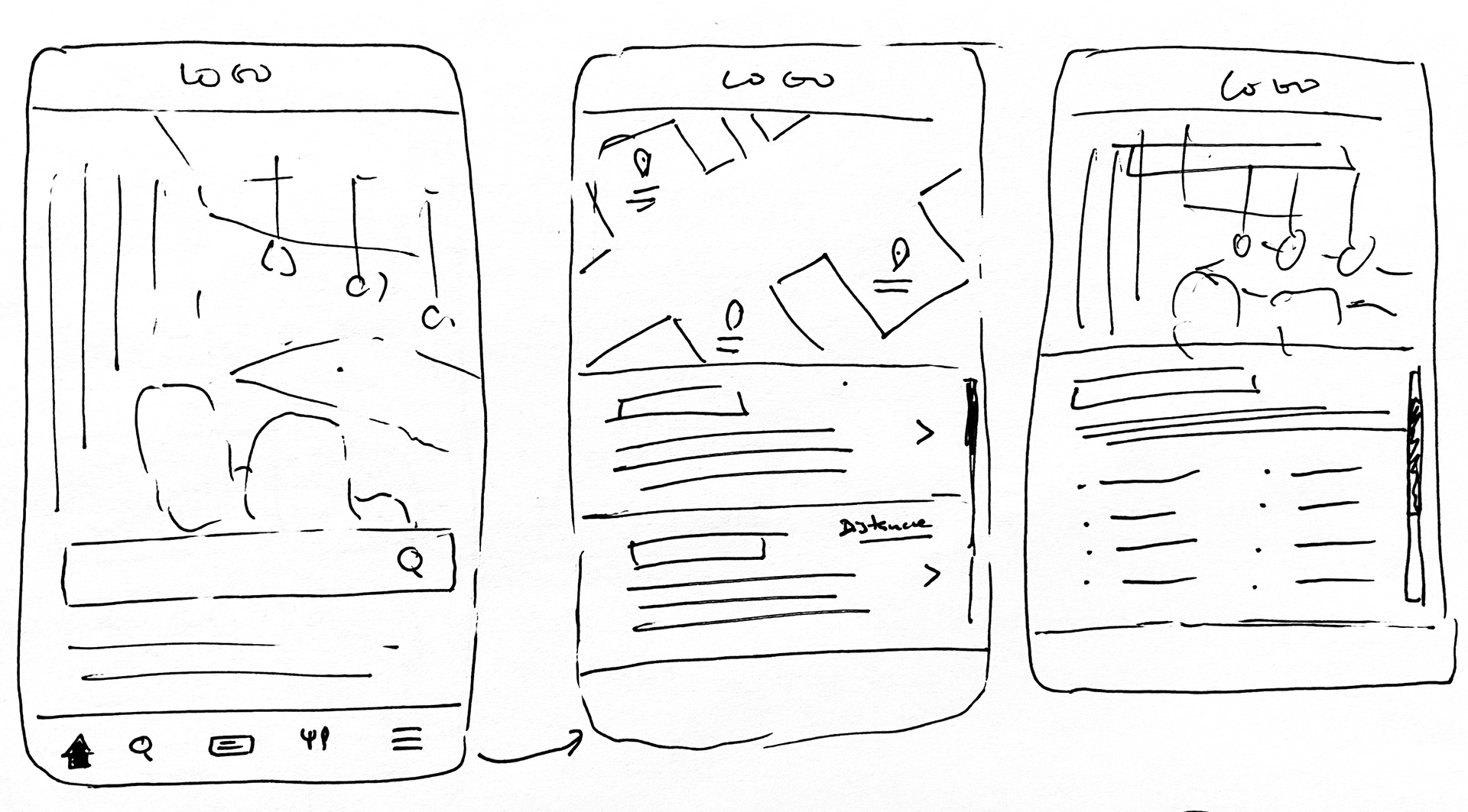
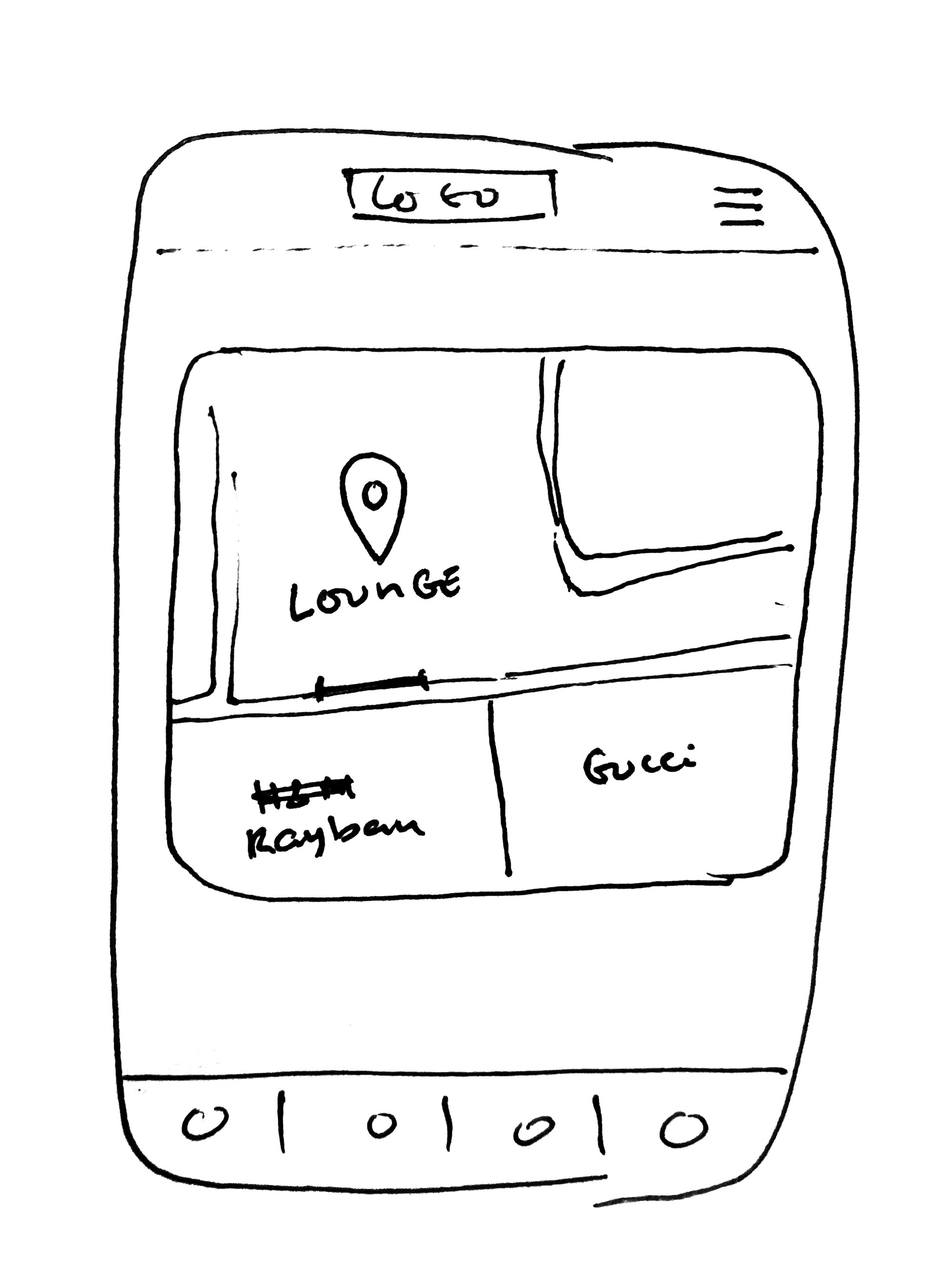
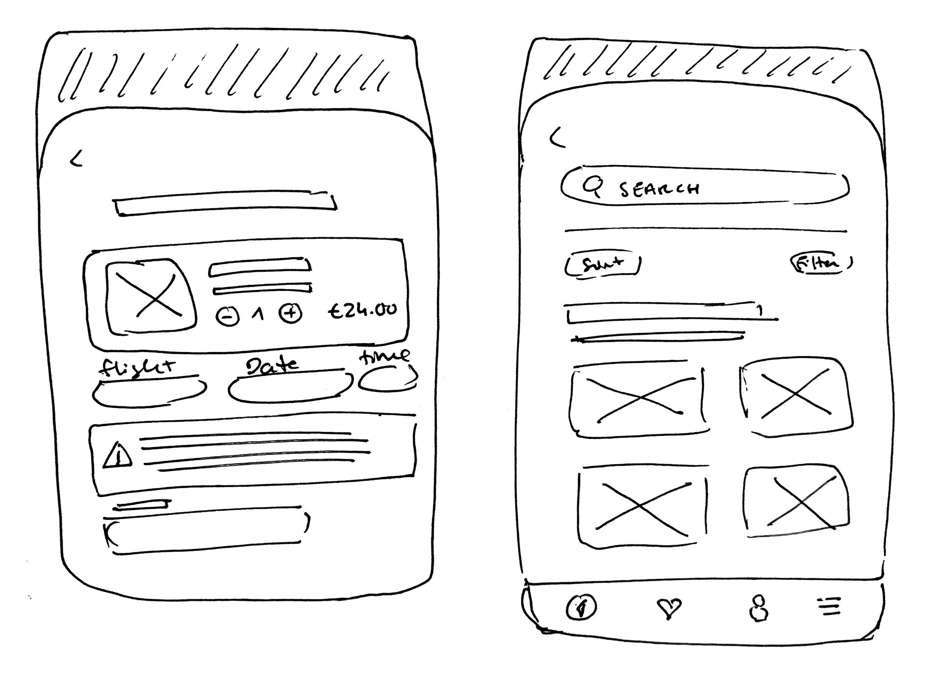
I started with hand-drawn wireframes to rough out the core concepts before moving into Figma. The focus was on simplifying the user journey, making it immediately clear what's included with membership and lounge purchases, while improving conversion through registration and giving users visibility into lounge capacity before they buy.
Lounge app
Login page
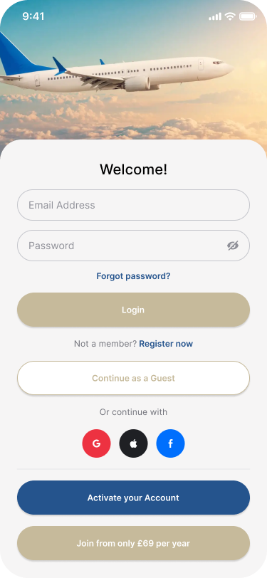
This page holds a lot of information, but it's organised so nothing feels overwhelming. Users can log in or register with Google, Apple or Facebook — the flexibility people expect from apps like this — with account activation and membership registration kept front and centre as the key actions.
Login page
This page holds a lot of information, but it's organised so nothing feels overwhelming. Users can log in or register with Google, Apple or Facebook — the flexibility people expect from apps like this — with account activation and membership registration kept front and centre as the key actions.
Membership selection page
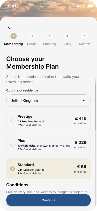
I simplified the steps for choosing and registering for a membership, with usability as the priority. If I revisited this, I'd make the benefits of each plan more visible at a glance.
I simplified the steps for choosing and registering for a membership, with usability as the priority. If I revisited this, I'd make the benefits of each plan more visible at a glance.
Welcome page
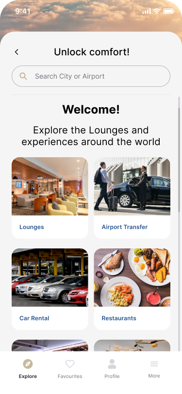
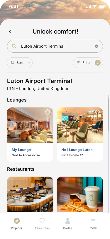
After registering, users land on a welcome page summarising what's included in their membership. From there, they can search for an airport and browse available services, with sorting and filters to make navigation easier, and a heart icon to favourite lounges.
After registering, users land on a welcome page summarising what's included in their membership. From there, they can search for an airport and browse available services, with sorting and filters to make navigation easier, and a heart icon to favourite lounges.
Lounge information & map
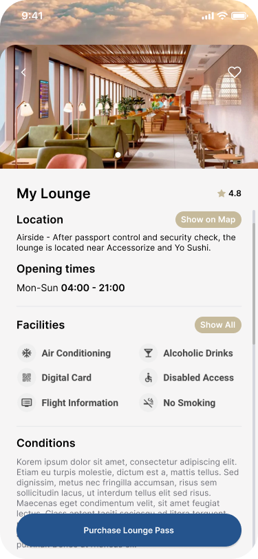
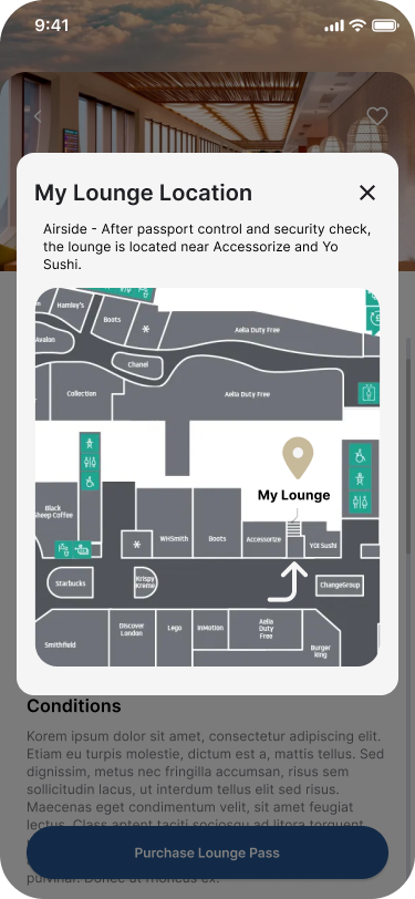
Selecting a lounge shows its location, opening times, facilities and entry conditions. I added a "Show on map" button so users can see exactly where it sits within the airport without leaving the page.
Selecting a lounge shows its location, opening times, facilities and entry conditions. I added a "Show on map" button so users can see exactly where it sits within the airport without leaving the page.
Lounge information & map
Selecting a lounge shows its location, opening times, facilities and entry conditions. I added a "Show on map" button so users can see exactly where it sits within the airport without leaving the page.
Selecting a lounge shows its location, opening times, facilities and entry conditions. I added a "Show on map" button so users can see exactly where it sits within the airport without leaving the page.
Lounge pass purchase
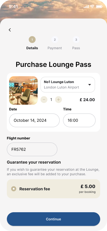
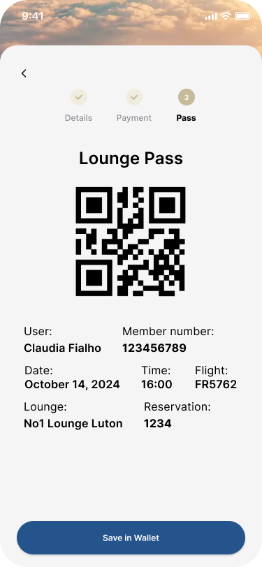
Users start by choosing the number of passes, along with their visit date and time. If a lounge is full, an alert steps in straight away so they can pick another lounge or a different time before going any further. Next, they add their flight number, which unlocks gate and delay notifications, and pay a small reservation fee to hold their spot with no obligation. The pass then saves to their digital wallet and stays accessible from their profile.